Welcome to our wiki page: ''How to visually interpret biological data using networks''
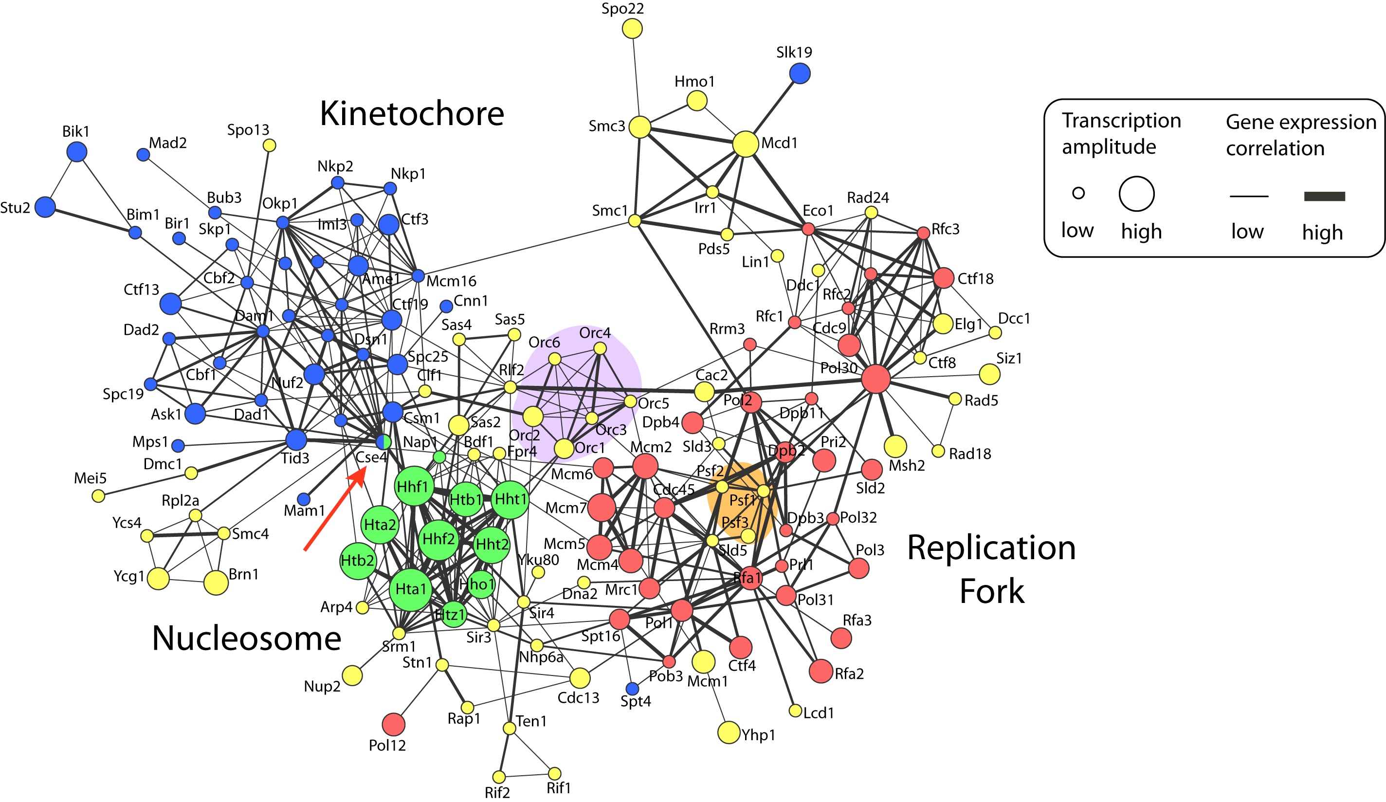
From this page you can learn more about the different datasets used to build the network shown in Figure 1b of the Primer about network visualization [Merico, D. Gfeller, D. & Bader, G.D., Nat. Biotech. x, x (2009), PDF] and download them if you want to try visualizing and analyzing them with your own tools.
How to visually interpret biological data using networks
Merico D, Gfeller D, Bader GD
Nature Biotechnology 2009 Oct 27, 921-924
PubMed Abstract - PDF

Figure 1: Network visualization of chromosome maintenance and duplication machinery in baker’s yeast, Saccharomyces cerevisiae (yeast_duplication_network.pdf).
Figure description
Nodes represent proteins that are annotated as being located on the chromosome by the Gene Ontology project (for clarity, the suffix ‘p’ has been removed from yeast protein names). Node colors specify chromosomal location sub-categories: replication fork, red; nucleosome, green; kinetochore, blue; and other chromosome components, yellow. Edges represent protein-protein interactions that were manually extracted from publications by BioGRID database curators. Gene expression data of cells monitored during one round of the cell cycle are visually annotated on the network. Edge width encodes positive Pearson correlation between transcript profiles. Node size corresponds to the transcriptional amplitude, which is a measure of how much expression changes over the cell cycle. The network was visualized using the Cytoscape software.
Datasets
The datasets described below can be freely downloaded. They have been formatted to be readily usable with Cytoscape software.
Protein-protein interactions protein-protein_interaction.sif
Proteins interactions are retrieved from the BioGRID database. Interactions between yeast proteins annotated as being located on the chromosome by the Gene Ontology (GO) (Cellular Component: chromosome and all its children) are listed. BioGRID interactions were filtered to keep only physical interactions described as "manually curated" (i.e. no data coming exclusively from automated literature mining have been included). Finally, we restricted ourselves to the proteins forming the largest connected component of the network.GO annotations GO_annotation.txt
Three sub-categories of the GO chromosome category were used to further specify the yeast proteins: replication fork (red), nucleosome (green) and kinetochore (blue). Cse4 is annotated to both the nucleosome and the kinetochore.Yeast gene names yeast_gene_name.txt
Systematic and standard name of the proteins.Gene expression amplitude gene_expression_amplitude.txt
Gene expression data come from [Spellman et al. Mol. Biol. Cell 9, 3273-3279 (1998), pubmed]. The gene expression amplitude was measured as the root mean square of the time-course expression values.Gene expression correlation gene_expression_correlation.txt
For each pair of interacting proteins, we computed the Pearson correlation coefficient between the corresponding transcription profiles. Negative correlations were given a value of 0. These data only represent gene expression correlations between interacting proteins. The correlations between all pairs of proteins can be downloaded here: gene_expression_correlation_full.txt
Visualizing the network using Cytoscape
- Download all the files listed above and make sure you have Cytoscape installed and running smoothly.
- Open Cytoscape.
- Go to File/Import/network(multiple file types) and select "protein_protein_interaction.sif".
- Go to File/Import/Node Attributes and select "GO_annotation.txt".
- Go to File/Import/Node Attributes and select "yeast_gene_names.txt".
- Go to File/Import/Node Attributes and select "gene_expression_amplitude.txt".
- Go to File/Import/Edge Attributes and select "gene_expression_correlation.txt".
- To layout the network, go to Layout/Cytoscape Layouts/Force-directed Layouts/unweighted. You can try other layouts as well.
- Go to View/Show Graphics Details to see the original gene names.
- To add colors to the nodes, click on VizMapperTM button (you may need to click on the right arrow after the network button). In the Visual Mapping Browser double click "Node Color". Please select a value! appears on the right column: select "GO annotation". Please select a mapping!: choose "Discrete Mapping". For each GO category, you can now choose the color you want.
- To display the standard protein names as node labels, double click "Node Label". Select "Yeast gene names" and choose "Passthrough Mapping".
- To change the size of the nodes according to their gene expression amplitude, double click on "Node Size". Select "Gene expression amplitude". Choose "Continuous Mapping". Clicking on the chart that appears, you can now choose what node size you wish for the different amplitude values.
- To change the width of the edges according to the gene expression correlation, double click on Edge Size. Select "Gene expression correlation" and choose "Continuous Mapping". You can now choose what edge width you wish for the different correlation values.
Many other options to improve the layout or add other kind of visual attributes are available within Cytoscape. Have fun playing with them!