|
Size: 2935
Comment:
|
Size: 3169
Comment:
|
| Deletions are marked like this. | Additions are marked like this. |
| Line 33: | Line 33: |
| After some manual editing, to remove overly generic terms and to tag the clusters, this is the final picture: | {{attachment:EBC_tTest_01_PreEditing.png|EM1|width=585 height=466}} After some manual editing, to refine the map layout and to tag the clusters, this is the final picture: {{attachment:EBC_tTest_02_PostEditing_Cropped.png|EM2|width=585 height=466}} |
| Line 38: | Line 42: |
{{attachment:EBC_12hr24hr_2c_Local_CellCycle_07_Framed.png|EM3|width=585 height=466}} |
The Enrichment Map Plugin
Concept
Enrichment analysis (also known as functional enrichment) is an helpful technique for high-throughput data interpretation. Given a list of genes resulting from an experiment, enrichment analysis enables to identify functional categories that are over-represented. Such functional categories are typically derived from functional annotations (such as the Gene Ontology), or from pathway databases (such as KEGG), or other resources (such as the collection of disease signatures in MSig DB, or protein complexes in MIPS).
However, enrichment results are often characterized by lots of redundancy and inter-dependencies between gene-sets representing functional categories. For instance, Response to radiation, DNA Integrity Checkpoint and p53 Pathway have all several genes in common. Since the typical enrichment analysis can output up to 300 hundred different gene-sets, some form of organization is required to navigate results. The Gene Ontology has its own hierarchical structure, but what about other resources?
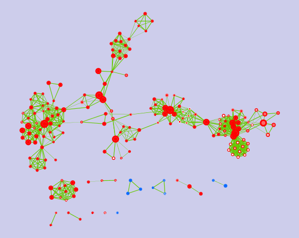
To address this, we organize gene-sets into a network, called enrichment map. Two gene-sets are connected in the enrichment map if they have a high overlap, i.e. if they share many genes. Applying automatic layout techniques, groups of inter-related gene-sets tend to cluster together, providing for a much easier and intuitive visualization.
Features
- compatible with any type of gene-set and any enrichment analysis method
- fast-lane for uploading GSEA (Gene Set Enrichment Analysis) results
- visualize enrichment p-values as a color gradient
- compare two enrichments for multi-condition experiments or meta-analysis
- explore gene expression patterns at the gene level using heat-maps
- tune stringency parameters (p-value, FDR) and visualize the effect in real-time
Sample Results
In this example, we analyzed a microarray experiment studying MCF7 breast cancer response to estrogen. Cell were cultured with or without estrogen and then sampled at 12 and 24 hours. Gene differentiality was assessed for the two time-points separately using the t-test. Gene Ontology terms were tested using GSEA.
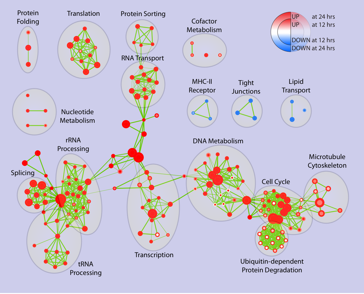
The node colors map enrichment significance:
red: significantly up-regulated (after estrogen treatment)
white: not significant
blue: significantly down-regulated (after estrogen treatment)
In the enrichment map, the two time-points are mapped as follows:
- 12h to the node center
- 24h to the node border
This is the plugin output:

After some manual editing, to refine the map layout and to tag the clusters, this is the final picture:

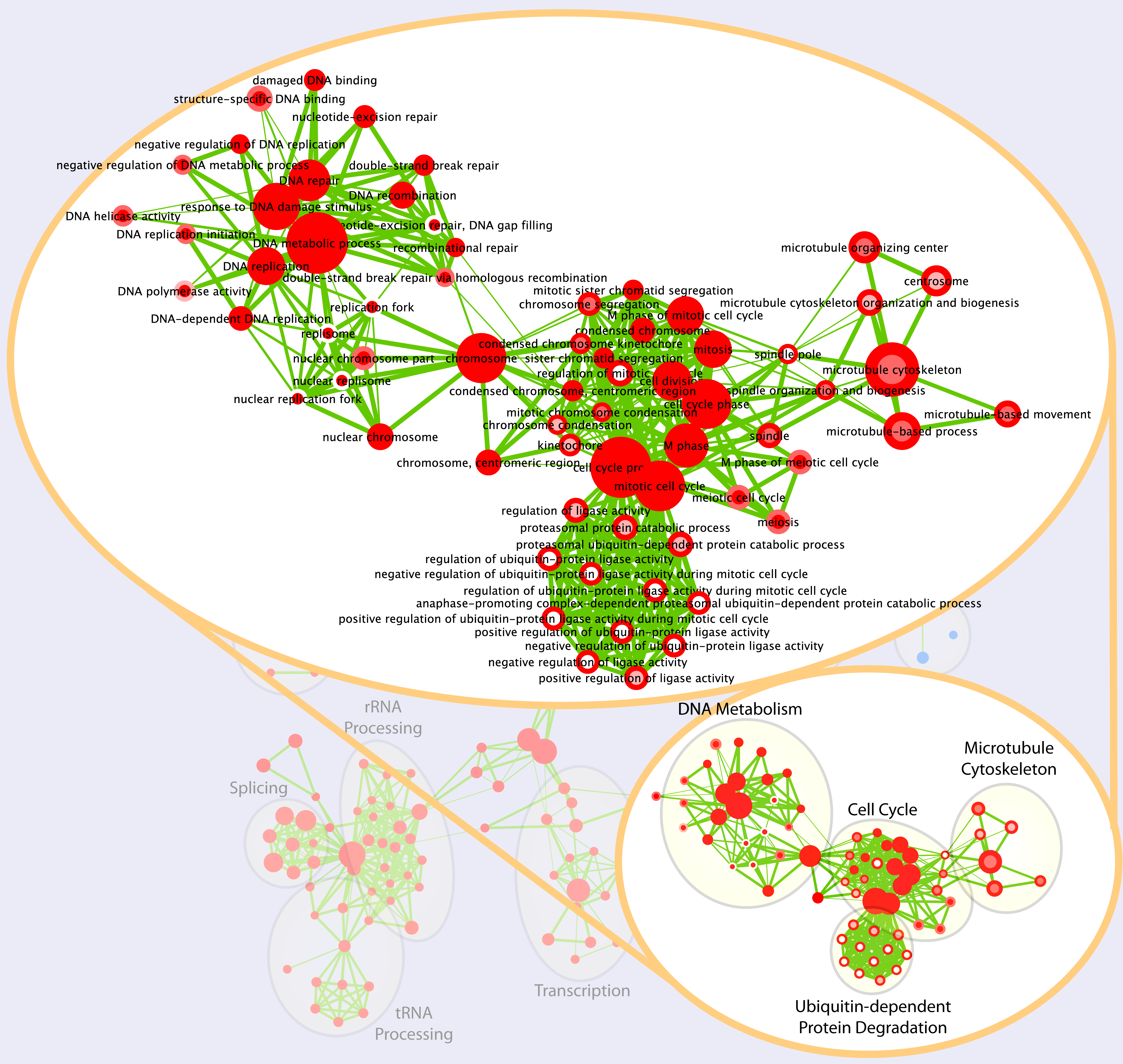
This is what we see when we zoom onto a map cluster:
For detailed instruction on uploading this data-set, please go to this tutorial page.

